

Revamping Campaign Management for Scalable
Multi-Channel Engagement
Revamping Campaign Management for Scalable
Multi-Channel Engagement
Revamping Campaign Management for Scalable Multi-Channel Engagement
Revamping Campaign Management for
Scalable Multi-Channel Engagement
Simplifying complex campaign workflows using the scalable design system to improve usability and efficiency.
First, a little context
First, a little context
Overview
Overview
Overview
Five9 Campaign Manager is an enterprise campaign management platform that lets teams schedule and manage customer outreach across voice, SMS and digital channels. Used by Fortune 500 organizations, it supports the creation and management of campaigns across 40+ interconnected modules, helping teams run large scale customer engagement workflows with greater efficiency and visibility.
Five9 Campaign Manager is an enterprise campaign management platform that lets teams schedule and manage customer outreach across voice, SMS and digital channels. Used by Fortune 500 organizations, it supports the creation and management of campaigns across 40+ interconnected modules, helping teams run large scale customer engagement workflows with greater efficiency and visibility.
Project details
Project details
Project details
Time
4 months
Tools
Figma, Chatgpt
Design System
Nimbus
Scope
Web Application
Design Team
Design Team
Senior UI/UX Designer
Senior UI/UX Designer
Mid level UI/UX Designer
UI/UX Designer (me)
Redesigned Campaign Manager, module by module.
Redesigned Campaign Manager, module by module.
Five9 Campaign Manager was already an established enterprise product.
The brief wasn’t to invent a new campaign platform. The product already had established workflows, terminology, business logic and users.
I was assigned particular modules to redesign within that existing ecosystem. That meant I couldn’t simply redesign whatever looked outdated. Every change had to work with the rest of the product. And as I started going through the modules, I noticed a pattern. So before redesigning anything, I needed to understand what was actually happening underneath the screens.
Five9 Campaign Manager was already an established enterprise product.
The brief wasn’t to invent a new campaign platform. The product already had established workflows, terminology, business logic and users.
I was assigned particular modules to redesign within that existing ecosystem. That meant I couldn’t simply redesign whatever looked outdated. Every change had to work with the rest of the product. And as I started going through the modules, I noticed a pattern. So before redesigning anything, I needed to understand what was actually happening underneath the screens.
UX Audit
UX Audit
Identifying usability and hierarchy issues across existing modules.
Identifying usability and hierarchy issues across existing modules.
Information Architecture
Information Architecture
Restructuring navigation, content relationships and simplifying complex workflows.
Restructuring navigation, content relationships and simplifying complex workflows.
UX / UI Design
UX / UI Design
Redesigning assigned Campaign Manager modules and their key workflows.
Redesigning assigned Campaign Manager modules and their key workflows.
UX / UI Design
Redesigning assigned Campaign Manager modules and their key workflows.
Design System
Applying and extending reusable components across the product.
Accessibility
Accessibility
Addressing keyboard, focus, contrast and accessible interaction requirements.
Addressing keyboard, focus, contrast and accessible interaction requirements.
Collaboration
Collaboration
Working with developers, QA & stakeholders from design through implementation.
Working with developers, QA & stakeholders from design through implementation.
Design System
Design System
Applying and extending reusable components across the product.
Applying and extending reusable components across the product.
Understanding the Existing Product
Understanding the Existing Product
I didn’t have direct access to end users, so I didn’t want to pretend I had conducted user interviews or usability testing. Instead, I triangulated what I could learn from five stakeholder walkthroughs, Product and Engineering discussions, existing documentation and tickets. This gave me two types of information. What the product currently did. And: where people were already questioning it. That distinction became important throughout the redesign.
I didn’t have direct access to end users, so I didn’t want to pretend I had conducted user interviews or usability testing. Instead, I triangulated what I could learn from five stakeholder walkthroughs, Product and Engineering discussions, existing documentation and tickets. This gave me two types of information. What the product currently did. And: where people were already questioning it. That distinction became important throughout the redesign.
Stakeholder Discussion
Stakeholder Discussion
Reviewing current screens
Reviewing current screens
Business requirements
Business requirements
Existing workflow analysis
Existing workflow analysis
What the product does, and where people question it
What the product does, and where people question it
My Approach
My Approach
My Approach
I approached the redesign by first understanding the existing product, its modules, workflows and underlying patterns before making changes.
I approached the redesign by first understanding the existing product, its modules, workflows and underlying patterns before making changes.
Reviewed existing Campaign Manager modules
Reviewed existing Campaign Manager modules
Audited hierarchy, navigation and interaction patterns
Audited hierarchy, navigation and interaction patterns
Mapped key workflows and dependencies
Mapped key workflows and
dependencies
Mapped key workflows and
dependencies
Identified repeated UX and UI patterns
Identified repeated UX and UI
patterns
Identified repeated UX and UI
patterns
Validated assumptions through stakeholder discussions
Validated assumptions through stakeholder discussions
Translated findings into reusable design solutions
Translated findings into reusable design solutions
Problems Identified
Problems Identified
Problems Identified
The audit revealed inconsistencies across navigation, hierarchy and interactions that made some workflows harder to understand and use.
The audit revealed inconsistencies across navigation, hierarchy and interactions that made some workflows harder to understand and use.
Inconsistent information hierarchy
Inconsistent information hierarchy
Unclear primary and secondary actions
Unclear primary and secondary actions
Complex and unclear workflows
Complex and unclear workflows
Tightly coupled
module structures
Tightly coupled module structures
Tightly coupled module structures
Inconsistent component usage
Inconsistent component usage
Inconsistent component
usage
Unclear campaign status and states
Unclear campaign status and states
Limited accessibility across interactions
Limited accessibility across interactions
Dense content with limited flexibility
Dense content with limited flexibility
I found one problem hiding in the navigation
I found one problem
hiding in the
navigation
I found one problem hiding in the navigation
I found one problem
hiding in the navigation
While working on user creation, I noticed that Users and Roles were being handled together. But they represented different things. A user is a person. A role defines permissions.
Keeping them together made the information architecture feel like users needed to understand the product’s internal structure before they could manage it. So I proposed separating them into their own navigation areas.
The important part wasn’t adding another navigation item. It was recognising that the relationship between two concepts doesn’t mean they need to share the same place in the interface.
While working on user creation, I noticed that Users and Roles were being handled together. But they represented different things. A user is a person. A role defines permissions.
Keeping them together made the information architecture feel like users needed to understand the product’s internal structure before they could manage it. So I proposed separating them into their own navigation areas.
The important part wasn’t adding another navigation item. It was recognising that the relationship between two concepts doesn’t mean they need to share the same place in the interface.


Reducing the Initial Setup Burden
Reducing the
Initial Setup Burden
Reducing the Initial Setup Burden
Reducing the Initial
Setup Burden
A key design decision across all creation flows was to reduce the initial setup burden. Rather than requiring users to configure every setting during creation, the flow was redesigned to capture only the essential information needed to create a line item. Additional configurations could then be completed later through the edit flow. This progressive approach reduced cognitive load, accelerated task completion, and made complex workflows feel significantly more manageable.
A key design decision across all creation flows was to reduce the initial setup burden. Rather than requiring users to configure every setting during creation, the flow was redesigned to capture only the essential information needed to create a line item. Additional configurations could then be completed later through the edit flow. This progressive approach reduced cognitive load, accelerated task completion, and made complex workflows feel significantly more manageable.

Create Action
Create Action
This will redirect to new campaign creation screen
This will redirect to new campaign creation screen.
This will redirect to new campaign creation screen
This will redirect to new campaign creation screen
Create Action
Create Action
Basic information is collected in the creation screen.
Basic information is collected in the creation screen.
Basic information is collected in the creation screen.


Edit & Continue Setup
Edit & Continue Setup
Continue configuration in an editable detail view. This will create the campaign and redirect to Edit/detail screen with success toaster. Simplified the campaign creation flow by showing only essential steps upfront and moving advanced configurations to the edit stage.
Continue configuration in an editable detail view. This will create the campaign and redirect to Edit/detail screen with success toaster. Simplified the campaign creation flow by showing only essential steps upfront and moving advanced configurations to the edit stage.
Continue configuration in an editable detail view. This will create the campaign and redirect to Edit/detail screen with success toaster. Simplified the campaign creation flow by showing only essential steps upfront and moving advanced configurations to the edit stage.
Two modules, Breaking down
the final design piece by piece
Two modules, Breaking down
the final design piece by piece
The redesign spanned 100+ screens across the platform. Below are two modules representative screens I can walk through in detail from problem to decision rationale. The original 'before' interface is no longer accessible (the legacy portal has since been decommissioned), so these are the screens I was able to capture before that access was lost.
The redesign spanned 100+ screens across the platform. Below are two modules representative screens I can walk through in detail from problem to decision rationale. The original 'before' interface is no longer accessible (the legacy portal has since been decommissioned), so these are the screens I was able to capture before that access was lost.
Campaign Groups
Campaign Groups
Campaign Groups serves as one of the core workflow that brings together strategy configuration, channel selection, audience targeting, and execution.
Campaign Groups serves as one of the core workflow that brings together strategy configuration, channel selection, audience targeting, and execution.
Status Visibility & System Feedback
Status Visibility & System
Feedback
Status Visibility & System Feedback
Status Visibility & System Feedback
For reviewers processing dozens of campaigns a day, ambiguous status colors meant re-checking work that was already approved a direct hit to their daily throughout.
For reviewers processing dozens of campaigns a day, ambiguous status colors meant re-checking work that was already approved a direct hit to their daily throughout.
Before - Home Screen
Before - Home Screen

Before: Campaign status was communicated through heavy red blocks that dominated the table regardless of severity a minor pending action looked identical in urgency to a blocking error and poor toaster message that appears on top left.
Before: Campaign status was communicated through heavy red blocks that dominated the table regardless of severity a minor pending action looked identical in urgency to a blocking error and poor toaster message that appears on top left.
After - Home Screen
After - Home Screen

After: I introduced a tiered status system where color, icon, and label working together so reviewers could tell at a glance what needed action versus what was already resolved, cutting redundant re-checks out of their workflow entirely. User gets notified through toasters that are colors coded.
After: I introduced a tiered status system where color, icon, and label working together so reviewers could tell at a glance what needed action versus what was already resolved, cutting redundant re-checks out of their workflow entirely. User gets notified through toasters that are colors coded.
Before: Campaign status was communicated through heavy red blocks that dominated the table regardless of severity a minor pending action looked identical in urgency to a blocking error and poor toaster message that appears on top left.
Before - Home Screen
Before: Campaign status was communicated through heavy red blocks that dominated the table regardless of severity a minor pending action looked identical in urgency to a blocking error and poor toaster message that appears on top left.
Before: Campaign status was communicated through heavy red blocks that dominated the table regardless of severity a minor pending action looked identical in urgency to a blocking error and poor toaster message that appears on top left.
After - Home Screen

After: I introduced a tiered status system where color, icon, and label working together so reviewers could tell at a glance what needed action versus what was already resolved, cutting redundant re-checks out of their workflow entirely. User gets notified through toasters that are colors coded.
After: I introduced a tiered status system where color, icon, and label working together so reviewers could tell at a glance what needed action versus what was already resolved, cutting redundant re-checks out of their workflow entirely. User gets notified through toasters that are colors coded.
Modal Overload & Visual Hierarchy
Modal Overload & Visual
Hierarchy
Modal Overload & Visual Hierarchy
When a submitter can't visually distinguish where one section ends and the next begins, or which action actually moves them forward, setup stops being a quick task and becomes a hunt and losing all background context in a full-screen overlay meant users had no way to cross-reference the record they were configuring against, forcing them to close and reopen the flow just to check something they should've been able to see the whole time.
When a submitter can't visually distinguish where one section ends and the next begins, or which action actually moves them forward, setup stops being a quick task and becomes a hunt and losing all background context in a full-screen overlay meant users had no way to cross-reference the record they were configuring against, forcing them to close and reopen the flow just to check something they should've been able to see the whole time.
After - Add Campaign Group
Before - Add Campaign Group
Before - Add Campaign Group
Before - Add Campaign Group

Before: The "Add Voice Campaign Group" flow buried its primary action inside a low-contrast round button with no visual dominance. The full-screen overlay blocked all background context, and input borders fell below usable contrast thresholds. Required fields are not informed before hand.
Before: The "Add Voice Campaign Group" flow buried its primary action inside a low-contrast round button with no visual dominance. The full-screen overlay blocked all background context, and input borders fell below usable contrast thresholds. Required fields are not informed before hand.
After - Add Campaign Group
After - Add Campaign Group


.After: I added the modal to preserve background context instead of fully obscuring it, and elevated critical system constraints like "Name and type can't be edited after saving" out of buried helper text into a structured information alert at the top of the flow, so users made irreversible decisions with the right information in front of them, not after the fact. I collected the basic information for creation not forcing the user to fill in all details right away they are given the option to create and create & edit option. I also brought the modal in line with the system's design tokens for typography and spacing, so section boundaries read clearly without needing labels to do all the work.
Before - Add Campaign Group
After - Add Campaign Group
After - Add Campaign Group

.After: I added the modal to preserve background context instead of fully obscuring it, and elevated critical system constraints like "Name and type can't be edited after saving" out of buried helper text into a structured information alert at the top of the flow, so users made irreversible decisions with the right information in front of them, not after the fact. I collected the basic information for creation not forcing the user to fill in all details right away they are given the option to create and create & edit option. I also brought the modal in line with the system's design tokens for typography and spacing, so section boundaries read clearly without needing labels to do all the work.
.After: I added the modal to preserve background context instead of fully obscuring it, and elevated critical system constraints like "Name and type can't be edited after saving" out of buried helper text into a structured information alert at the top of the flow, so users made irreversible decisions with the right information in front of them, not after the fact. I collected the basic information for creation not forcing the user to fill in all details right away they are given the option to create and create & edit option. I also brought the modal in line with the system's design tokens for typography and spacing, so section boundaries read clearly without needing labels to do all the work.
High Cognitive Load & Weak Feedback
High Cognitive Load & Weak
Feedback
High Cognitive Load & Weak Feedback
For a parameter-heavy configuration screen like this, ungrouped fields don't just look messy they raise the real risk of a user setting a threshold or increment value without understanding its effect, since nothing on screen told them what a safe or valid range even looked like. At the scale this platform operates, a misconfigured threshold isn't a cosmetic error, it's a live campaign behaving incorrectly.
For a parameter-heavy configuration screen like this, ungrouped fields don't just look messy they raise the real risk of a user setting a threshold or increment value without understanding its effect, since nothing on screen told them what a safe or valid range even looked like. At the scale this platform operates, a misconfigured threshold isn't a cosmetic error, it's a live campaign behaving incorrectly.
Before - Configure Campaign Group
Before - Configure Campaign Group

Before: Parameters for Balancing, Threshold, and Delivery settings were mixed together with no logical grouping, so a user configuring one aspect of the campaign had to visually parse the entire form to find related fields. There was no contextual help attached to any parameter a threshold or increment value with no explanation of what it controlled or what range was valid and the modal overlay reduced awareness of the record being edited in the background. Here the same input fields are differently handled at two places.
Before: Parameters for Balancing, Threshold, and Delivery settings were mixed together with no logical grouping, so a user configuring one aspect of the campaign had to visually parse the entire form to find related fields. There was no contextual help attached to any parameter a threshold or increment value with no explanation of what it controlled or what range was valid and the modal overlay reduced awareness of the record being edited in the background. Here the same input fields are differently handled at two places.
Before: Parameters for Balancing, Threshold, and Delivery settings were mixed together with no logical grouping, so a user configuring one aspect of the campaign had to visually parse the entire form to find related fields. There was no contextual help attached to any parameter a threshold or increment value with no explanation of what it controlled or what range was valid and the modal overlay reduced awareness of the record being edited in the background. Here the same input fields are differently handled at two places.
After - Configure Campaign Group
After: I restructured the form into clear parameter clusters Volume Settings, Threshold Controls, and Queue Configuration so related fields are visually grouped instead of scattered. I added inline min/max range hints directly under each input (e.g. "Min: 1, Max: 99,999") so users get contextual guidance at the point of entry rather than having to guess or fail on submit, and gave toggle states like campaign segment balancing explicit visual differentiation so enabled/disabled states are unambiguous at a glance.
After: I restructured the form into clear parameter clusters Volume Settings, Threshold Controls, and Queue Configuration — so related fields are visually grouped instead of scattered. I added inline min/max range hints directly under each input (e.g. "Min: 1, Max: 99,999") so users get contextual guidance at the point of entry rather than having to guess or fail on submit, and gave toggle states like campaign segment balancing explicit visual differentiation so enabled/disabled states are unambiguous at a glance.
After - Configure Campaign Group
After: I restructured the form into clear parameter clusters Volume Settings, Threshold Controls, and Queue Configuration — so related fields are visually grouped instead of scattered. I added inline min/max range hints directly under each input (e.g. "Min: 1, Max: 99,999") so users get contextual guidance at the point of entry rather than having to guess or fail on submit, and gave toggle states like campaign segment balancing explicit visual differentiation so enabled/disabled states are unambiguous at a glance.
After - Configure Campaign Group
After - Configure Campaign Group
After: I restructured the form into clear parameter clusters Volume Settings, Threshold Controls, and Queue Configuration so related fields are visually grouped instead of scattered. I added inline min/max range hints directly under each input (e.g. "Min: 1, Max: 99,999") so users get contextual guidance at the point of entry rather than having to guess or fail on submit, and gave toggle states like campaign segment balancing explicit visual differentiation so enabled/disabled states are unambiguous at a glance.

After: I restructured the form into clear parameter clusters Volume Settings, Threshold Controls, and Queue Configuration so related fields are visually grouped instead of scattered. I added inline min/max range hints directly under each input (e.g. "Min: 1, Max: 99,999") so users get contextual guidance at the point of entry rather than having to guess or fail on submit, and gave toggle states like campaign segment balancing explicit visual differentiation so enabled/disabled states are unambiguous at a glance.
After: I restructured the form into clear parameter clusters Volume Settings, Threshold Controls, and Queue Configuration so related fields are visually grouped instead of scattered. I added inline min/max range hints directly under each input (e.g. "Min: 1, Max: 99,999") so users get contextual guidance at the point of entry rather than having to guess or fail on submit, and gave toggle states like campaign segment balancing explicit visual differentiation so enabled/disabled states are unambiguous at a glance.
Historical Reports
Historical Reports
A module for creating, scheduling, and reviewing past campaign reports, redesigned to reduce cognitive load, clarify saved report identity, and simplify complex filtering into a guided flow.. As one of the largest modules in the platform, it needed to handle a high volume of configuration options without overwhelming the user at any single step.
A module for creating, scheduling, and reviewing past campaign reports, redesigned to reduce cognitive load, clarify saved report identity, and simplify complex filtering into a guided flow.. As one of the largest modules in the platform, it needed to handle a high volume of configuration options without overwhelming the user at any single step.
A module for creating, scheduling, and reviewing past campaign reports, redesigned to reduce cognitive load, clarify saved report identity, and simplify complex filtering into a guided flow.. As one of the largest modules in the platform, it needed to handle a high volume of configuration options without overwhelming the user at any single step.
A module for creating, scheduling, and reviewing past campaign reports, redesigned to reduce cognitive load, clarify saved report identity, and simplify complex filtering into a guided flow.. As one of the largest modules in the platform, it needed to handle a high volume of configuration options without overwhelming the user at any single step.
Clear Copy and Hierarchy
Clear Copy and Hierarchy
For a module built around reviewing historical data across potentially dozens of saved reports, indistinguishable names and an unlabeled entry point meant users had to open reports one by one just to figure out which was which turning a lookup task into trial and error, and adding friction to a module people return to repeatedly rather than use once.
For a module built around reviewing historical data across potentially dozens of saved reports, indistinguishable names and an unlabeled entry point meant users had to open reports one by one just to figure out which was which turning a lookup task into trial and error, and adding friction to a module people return to repeatedly rather than use once.
Before - Home Screen
Before - Home Screen

Before: The main report list screen copy did not convey what it meant. The primary action to create a new report was a floating orange "+" button with no label, while the table itself gave no clear hierarchy between primary actions (view/open) and secondary ones (schedule, history, more options).
Before: The main report list screen copy did not convey what it meant. The primary action to create a new report was a floating orange "+" button with no label, while the table itself gave no clear hierarchy between primary actions (view/open) and secondary ones (schedule, history, more options).
Before: The main report list screen copy did not convey what it meant. The primary action to create a new report was a floating orange "+" button with no label, while the table itself gave no clear hierarchy between primary actions (view/open) and secondary ones (schedule, history, more options).
After - Home Screen

After: I gave saved reports as the name of the tab so users could know it as the "Home" list view. I replaced the unlabeled "+" with an explicit "Create New Report" button as the clear primary action, and surfaced supporting actions search, refresh, duplicate, filter, and export history as consistent icon-based secondary actions along the table header, so primary and secondary actions are never competing for the same visual weight.
After - Home Screen
After - Home Screen

After: I gave saved reports as the name of the tab so users could know it as the "Home" list view. I replaced the unlabeled "+" with an explicit "Create New Report" button as the clear primary action, and surfaced supporting actions search, refresh, duplicate, filter, and export history as consistent icon-based secondary actions along the table header, so primary and secondary actions are never competing for the same visual weight. I also restructured the sidebar so Historical Reports sits clearly within a "Reports" group alongside Dashboard, Data Extract, and Performance, giving it proper information-architecture context instead of sitting as an isolated item.
After: I gave saved reports as the name of the tab so users could know it as the "Home" list view. I replaced the unlabeled "+" with an explicit "Create New Report" button as the clear primary action, and surfaced supporting actions search, refresh, duplicate, filter, and export history as consistent icon-based secondary actions along the table header, so primary and secondary actions are never competing for the same visual weight. I also restructured the sidebar so Historical Reports sits clearly within a "Reports" group alongside Dashboard, Data Extract, and Performance, giving it proper information-architecture context instead of sitting as an isolated item.
After: I gave saved reports as the name of the tab so users could know it as the "Home" list view. I replaced the unlabeled "+" with an explicit "Create New Report" button as the clear primary action, and surfaced supporting actions search, refresh, duplicate, filter, and export history as consistent icon-based secondary actions along the table header, so primary and secondary actions are never competing for the same visual weight. I also restructured the sidebar so Historical Reports sits clearly within a "Reports" group alongside Dashboard, Data Extract, and Performance, giving it proper information-architecture context instead of sitting as an isolated item.
After - Home Screen
After: I gave saved reports as the name of the tab so users could know it as the "Home" list view. I replaced the unlabeled "+" with an explicit "Create New Report" button as the clear primary action, and surfaced supporting actions search, refresh, duplicate, filter, and export history as consistent icon-based secondary actions along the table header, so primary and secondary actions are never competing for the same visual weight. I also restructured the sidebar so Historical Reports sits clearly within a "Reports" group alongside Dashboard, Data Extract, and Performance, giving it proper information-architecture context instead of sitting as an isolated item.
After: I gave saved reports as the name of the tab so users could know it as the "Home" list view. I replaced the unlabeled "+" with an explicit "Create New Report" button as the clear primary action, and surfaced supporting actions search, refresh, duplicate, filter, and export history as consistent icon-based secondary actions along the table header, so primary and secondary actions are never competing for the same visual weight. I also restructured the sidebar so Historical Reports sits clearly within a "Reports" group alongside Dashboard, Data Extract, and Performance, giving it proper information-architecture context instead of sitting as an isolated item.
Cognitive Overload
Cognitive Overload
Facing 89 checkboxes and every filter category open by default meant users had to scroll and hunt just to find the handful of fields they actually needed, turning report creation into a search task before it was even a configuration task.
Facing 89 checkboxes and every filter category open by default meant users had to scroll and hunt just to find the handful of fields they actually needed, turning report creation into a search task before it was even a configuration task.
Before - Filtering
Before - Filtering

Before: Every parameter, filter, and display field was crammed onto a single screen. 89 display field options alone, all expanded and visible at once alongside timezone, report view, period, and five filter tabs.
Before: Every parameter, filter, and display field was crammed onto a single screen. 89 display field options alone, all expanded and visible at once alongside timezone, report view, period, and five filter tabs.
After - Filtering
After - Filtering


After: I broke the flow into collapsible sections. Report Parameters, Data Filters, Display Fields so only relevant sections expand at a time, and moved deep field lists into a separate filtered view users open only when needed, letting them view and configure a large field selectively instead of scanning everything at once.
After: I broke the flow into collapsible sections. Report Parameters, Data Filters, Display Fields so only relevant sections expand at a time, and moved deep field lists into a separate filtered view users open only when needed, letting them view and configure a large field selectively instead of scanning everything at once.
After - Filtering
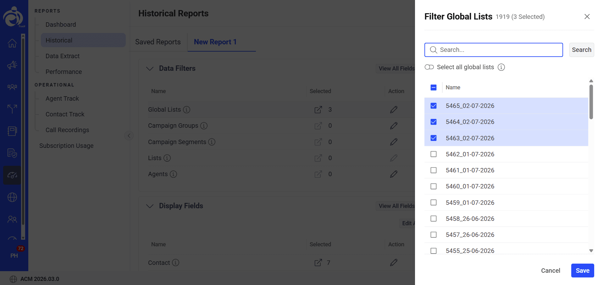
After: I broke the flow into collapsible sections. Report Parameters, Data Filters, Display Fields so only relevant sections expand at a time, and moved deep field lists into a separate filtered view users open only when needed, letting them view and configure a large field selectively instead of scanning everything at once.
Redundant Field Order
Redundant Field Order
Scheduling a recurring report without visible timezone context meant users couldn't be sure what time their report would actually send a small ambiguity that erodes trust every time the report doesn't land when expected.
For a parameter-heavy configuration screen like this, ungrouped fields don't just look messy they raise the real risk of a user setting a threshold or increment value without understanding its effect, since nothing on screen told them what a safe or valid range even looked like. At the scale this platform operates, a misconfigured threshold isn't a cosmetic error, it's a live campaign behaving incorrectly.
For a parameter-heavy configuration screen like this, ungrouped fields don't just look messy they raise the real risk of a user setting a threshold or increment value without understanding its effect, since nothing on screen told them what a safe or valid range even looked like. At the scale this platform operates, a misconfigured threshold isn't a cosmetic error, it's a live campaign behaving incorrectly.
Before - Schedule Report
Before - Schedule Report

Before: Frequency, day, and time fields sat in a single flat form with no timezone context shown, and a long warning paragraph about password protection ran directly beneath the email field with no visual separation.
Before: Frequency, day, and time fields sat in a single flat form with no timezone context shown, and a long warning paragraph about password protection ran directly beneath the email field with no visual separation.
Before: Frequency, day, and time fields sat in a single flat form with no timezone context shown, and a long warning paragraph about password protection ran directly beneath the email field with no visual separation.
Before: Frequency, day, and time fields sat in a single flat form with no timezone context shown, and a long warning paragraph about password protection ran directly beneath the email field with no visual separation.
After - Schedule Report

After: I added explicit timezone display next to Report Time, grouped Report Time and Report Day side by side instead of stacked separately, and gave the password warning its own visually distinct space instead of blending into surrounding form text.
After - Schedule Report
After - Schedule Report

After: I restructured the form into clear parameter clusters Volume Settings, Threshold Controls, and Queue Configuration — so related fields are visually grouped instead of scattered. I added inline min/max range hints directly under each input (e.g. "Min: 1, Max: 99,999") so users get contextual guidance at the point of entry rather than having to guess or fail on submit, and gave toggle states like campaign segment balancing explicit visual differentiation so enabled/disabled states are unambiguous at a glance.
After: I added explicit timezone display next to Report Time, grouped Report Time and Report Day side by side instead of stacked separately, and gave the password warning its own visually distinct space instead of blending into surrounding form text.
After: I added explicit timezone display next to Report Time, grouped Report Time and Report Day side by side instead of stacked separately, and gave the password warning its own visually distinct space instead of blending into surrounding form text.
After - Schedule Report
After: I added explicit timezone display next to Report Time, grouped Report Time and Report Day side by side instead of stacked separately, and gave the password warning its own visually distinct space instead of blending into surrounding form text.
After: I added explicit timezone display next to Report Time, grouped Report Time and Report Day side by side instead of stacked separately, and gave the password warning its own visually distinct space instead of blending into surrounding form text.
Rethinking Manage Contacts
Then I got one
completely wrong
I worked on Manage Contacts as an entire module.
I worked on Manage Contacts as an entire module.
Version 1
Version 1
My initial interpretation treated the filtering experience as part of a creation workflow. The assumption was roughly:
My initial interpretation treated the filtering experience as part of a creation workflow. The assumption was roughly:
Create template
Create template
Filter Contacts
Filter Contacts
Perform Action
Perform Action
View Data
View Data
Save template
Save template
Edit template
Create template
Filter Contacts
Perform Action
View Data
Save template
Edit template


But during stakeholder discussions, that model was challenged. The filters weren’t meant to force users into creating a template.
But during stakeholder discussions, that model was challenged. The filters weren’t meant to force users into creating a template.
Finalised Version
Finalised Version
The actual use case was more flexible. A user might simply want to follow this flow and they may or may not want to save that result. That changed the entire structure of the module. This was a full redesign of the module rather than a UI refinement. And this became one of the most useful lessons from the project: a design can be internally consistent and still be based on the wrong mental model.
The actual use case was more flexible. A user might simply want to follow this flow and they may or may not want to save that result. That changed the entire structure of the module. This was a full redesign of the module rather than a UI refinement. And this became one of the most useful lessons from the project: a design can be internally consistent and still be based on the wrong mental model.
Filter contacts
Filter contacts
View data
View data
Perform Action
Perform Action
Save as template or filter
Save as template or filter
Saved in queries
Saved in queries
Filter contacts
View data
Perform Action
Save as template or filter
Saved in queries


Going beyond the design system
Going beyond the design system
Script Designer
Script Designer
The client requested a workflow change for Script Designer that didn't map to any existing pattern in the platform this wasn't a straightforward redesign of an existing screen, but a rethink of how the module needed to function. Because this was for the main client, we had more room to deviate from the established design system than usual, as long as any new approach stayed achievable for the dev team to build.
The client requested a workflow change for Script Designer that didn't map to any existing pattern in the platform this wasn't a straightforward redesign of an existing screen, but a rethink of how the module needed to function. Because this was for the main client, we had more room to deviate from the established design system than usual, as long as any new approach stayed achievable for the dev team to build.

Edit Form
Repurposed the platform's existing form pattern to support conditional question logic and validators, letting non-technical staff build structured intake forms without needing a developer.
Edit Form
Repurposed the platform's existing form pattern to support conditional question logic and validators, letting non-technical staff build structured intake forms without needing a developer.
Edit Form
Repurposed the platform's existing form pattern to support conditional question logic and validators, letting non-technical staff build structured intake forms without needing a developer.
Repurposed the platform's existing form pattern to support conditional question logic and validators, letting non-technical staff build structured intake forms without needing a developer.

Drag & Drop Variables
Adapted the existing panel component into a searchable variable library, letting users insert business parameters and global variables directly into question text through drag and drop instead of manual entry.
Adapted the existing panel component into a searchable variable library, letting users insert business parameters and global variables directly into question text through drag and drop instead of manual entry.

Flowchart
Built a new visual flow view on top of existing platform patterns, giving users a clear map of question branching and conditions that didn't exist anywhere else in the platform before this module.
Flowchart
Built a new visual flow view on top of existing platform patterns, giving users a clear map of question branching and conditions that didn't exist anywhere else in the platform before this module.
Flowchart
Built a new visual flow view on top of existing platform patterns, giving users a clear map of question branching and conditions that didn't exist anywhere else in the platform before this module.
Built a new visual flow view on top of existing platform patterns, giving users a clear map of question branching and conditions that didn't exist anywhere else in the platform before this module.

Edit Flowchart
Connected the flowchart view directly to the form editor, so changes to conditional logic reflect immediately in both the visual flow and the underlying form, keeping the two in sync as the workflow gets built out.
Connected the flowchart view directly to the form editor, so changes to conditional logic reflect immediately in both the visual flow and the underlying form, keeping the two in sync as the workflow gets built out.
Extending the existing system
Sometimes the new
requirement
doesn’t fit the old
pattern
Sometimes the new requirement doesn’t fit the old
pattern
Sometimes the new
requirement doesn’t fit
the old pattern
While working on Tools, I came across a different kind of problem. The Purge & Archive section introduced a use case that the existing table structure wasn’t designed for. It needed a child table. Until that use case appeared, the existing structure was enough.
So rather than introducing a one-off solution inside the module, I explored how a parent-child table pattern could work within the broader product. I proposed the pattern to the Nimbus Council, considering how it could work for both the Report Table and Core Table.
While working on Tools, I came across a different kind of problem. The Purge & Archive section introduced a use case that the existing table structure wasn’t designed for. It needed a child table. Until that use case appeared, the existing structure was enough.
So rather than introducing a one-off solution inside the module, I explored how a parent-child table pattern could work within the broader product. I proposed the pattern to the Nimbus Council, considering how it could work for both the Report Table and Core Table.
The component had to serve the interaction, not just the system
The component had to serve the interaction, not just the system
One example was changing a slider-based interaction to a numeric control. The design system already had a suitable numeric component, but that wasn’t the only reason I used it.
One example was changing a slider-based interaction to a numeric control. The design system already had a suitable numeric component, but that wasn’t the only reason I used it.
Old Design
Old Design

For values where users may need to make precise changes across a large range, repeatedly dragging a slider isn’t always the most efficient interaction.
For values where users may need to make precise changes across a large range, repeatedly dragging a slider isn’t always the most efficient interaction.
New Design
New Design

A numeric input allows users to enter a value directly, increment/decrement precisely, and use the keyboard while still remaining consistent with the broader component system.
A numeric input allows users to enter a value directly, increment/decrement precisely, and use the keyboard while still remaining consistent with the broader component system.
New Design
A numeric input allows users to enter a value directl,increment/decrement precisely, and use the keyboard while still remaining consistent with the broader component system.
A numeric input allows users to enter a value directly, increment/decrement precisely, and use the keyboard while still remaining consistent with the broader component system.
A numeric input allows users to enter a value directl,increment/decrement precisely, and use the keyboard while still remaining consistent with the broader component system.
So the reasoning wasn’t: “The design system told me to use this.” It was: “The interaction called for precision, and the design system already gave me a consistent way to support it.” That’s a much stronger design rationale.
So the reasoning wasn’t: “The design system told me to use this.” It was: “The interaction called for precision, and the design system already gave me a consistent way to support it.” That’s a much stronger design rationale.
So the reasoning wasn’t: “The design system told me to use this.” It was: “The interaction called for precision, and the design system already gave me a consistent way to support it.” That’s a much stronger design rationale.
Collapsible Table
Collapsible Table
As multiple modules required expandable data tables, I identified a gap in the design system where no standardized collapsible table pattern existed. I explored several approaches and presented multiple design options. Through iterative discussions and refinements, the pattern was consolidated into a single solution
As multiple modules required expandable data tables, I identified a gap in the design system where no standardized collapsible table pattern existed. I explored several approaches and presented multiple design options. Through iterative discussions and refinements, the pattern was consolidated into a single solution


Explorations
Explorations
Text Wrap
Text Wrap
I identified a limitation in the design system around table headers with longer labels and proposed design solutions for supporting text wrapping. The recommendations focused on preserving readability, consistency, and scalability across data-heavy interfaces.
I identified a limitation in the design system around table headers with longer labels and proposed design solutions for supporting text wrapping. The recommendations focused on preserving readability, consistency, and scalability across data-heavy interfaces.


Grouped Headers
Grouped Headers
I proposed a grouped table header solution to better structure related data points within dense tables.
I proposed a grouped table header solution to better structure related data points within dense tables.

Designing Beyond the Visual Layer
Designing Beyond the Visual Layer
Accessibility wasn’t something I wanted to check after finishing the UI. Across the modules I worked on, I considered keyboard interaction, focus behaviour, narration/audio considerations, contrast and component states.
The challenge was particularly relevant in a product with dense enterprise workflows.
A hierarchy that works visually still needs to make sense when someone navigates it differently.
Accessibility wasn’t something I wanted to check after finishing the UI. Across the modules I worked on, I considered keyboard interaction, focus behaviour, narration/audio considerations, contrast and component states.
The challenge was particularly relevant in a product with dense enterprise workflows.
A hierarchy that works visually still needs to make sense when someone navigates it differently.
Accessibility wasn’t something I wanted to check after finishing the UI. Across the modules I worked on, I considered keyboard interaction, focus behaviour, narration/audio considerations, contrast and component states.
The challenge was particularly relevant in a product with dense enterprise workflows.
A hierarchy that works visually still needs to make sense when someone navigates it differently.
Narration testing
Narration testing
Used screen narration to confirm that content, labels, and interactive components were announced clearly and in the correct sequence.
Used screen narration to confirm that content, labels, and interactive components were announced clearly and in the correct sequence.
Keyboard navigation
Keyboard navigation
Verified that interactive elements could be accessed and navigated using only the keyboard, ensuring a logical focus order.
Verified that interactive elements could be accessed and navigated using only the keyboard, ensuring a logical focus order.
Verified that interactive elements could be accessed and navigated using only the keyboard, ensuring a logical focus
order.
Contrast audit
Contrast audit
Evaluated color contrast between text, UI elements, and backgrounds to improve readability and support users with visual impairments.
Evaluated color contrast between text, UI elements, and backgrounds to improve readability and support users with visual impairments.
From Design to Production
From Design to Production
For my assigned modules, I wasn’t only designing the screens. I was involved in the discussions around what we should build, stakeholder reviews, developer handoff and QA.
Every module I worked on received stakeholder approval and was implemented in production. As more modules adopted the shared patterns, inconsistencies became easier to address across the product.
For my assigned modules, I wasn’t only designing the screens. I was involved in the discussions around what we should build, stakeholder reviews, developer handoff and QA.
Every module I worked on received stakeholder approval and was implemented in production. As more modules adopted the shared patterns, inconsistencies became easier to address across the product.
What I Learned
What I Learned
Campaign Manager was my first deeper experience working on a complex B2B product. It taught me that enterprise UX isn’t necessarily about making everything look simpler. It’s about understanding why the complexity exists, deciding what users actually need to see and do, and creating a structure that helps them navigate that complexity.
I learned to question existing assumptions, defend design decisions with reasoning, take rejection as part of the process and think beyond the screen I was currently designing.
Campaign Manager was my first deeper experience working on a complex B2B product. It taught me that enterprise UX isn’t necessarily about making everything look simpler. It’s about understanding why the complexity exists, deciding what users actually need to see and do, and creating a structure that helps them navigate that complexity.
I learned to question existing assumptions, defend design decisions with reasoning, take rejection as part of the process and think beyond the screen I was currently designing.
Other Projects
Other Projects


Available for work
- Let’s Connect
I am open for
Full-Time roles.
Nivethaarul © 2026.
Available for work
- Let’s Connect
I am open for
Full-Time roles.
Nivethaarul © 2026.
Available for work
- Let’s Connect
I am open for
Full-Time roles.
Nivethaarul © 2026.
Available for work
- Let’s Connect
I am open for
Full-Time roles.
Nivethaarul © 2026.
Available for work
- Let’s Connect
I am open for
Full-Time roles.
Nivethaarul © 2026.
Available for work
- Let’s Connect
I am open for
Full-Time roles.
Nivethaarul © 2026.